Design System 101: How We Built Ours?
The design system acts as a repository for collections of reusable components and aims at closing the gap between designers and developers by providing easy access to pre-made design resources/components.

Fret not if you are new to design systems. The best way to learn is from the examples of others.
Last year we updated our website and reworked many features in Crystallize PIM to match our new branding. Our design team grew. We went from one solo designer to a team of three, with plans to hire even more designers in the future. In order to scale our team (and our product), we knew we’d greatly benefit from having a design system that would define our brand’s core UI/UX.
This is our first ever design system, and we’re delighted with how it’s turning out! However, the path to building it wasn’t linear, and we learned many things along the way.
In this article, we’d like to share some of the things we learned for anyone looking to build their system or improve upon the one they already have.
What Is a Design System?
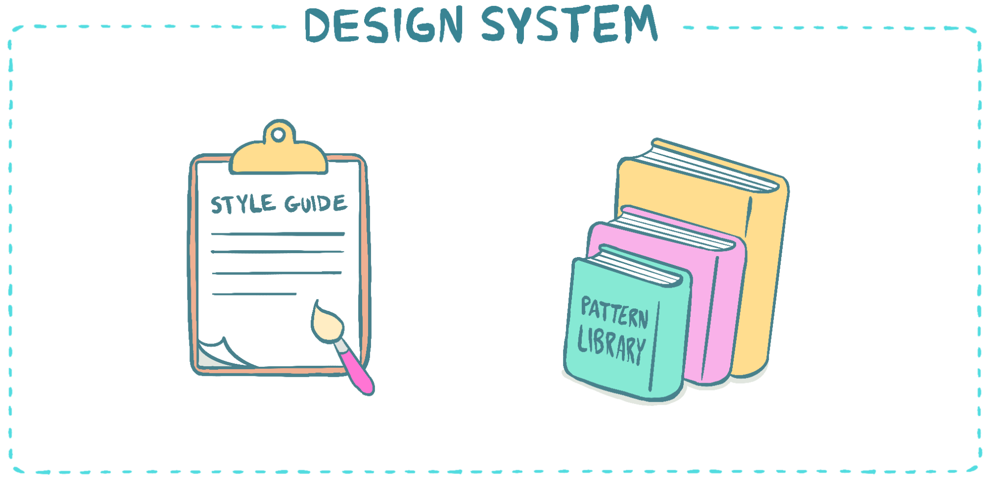
For those unfamiliar, a design system is a collection of components—and will often include buttons, colors, typography, form fields, menus, page layouts, and more. By having these components in a design system, designers can work more quickly using pre-made elements.
Since many UI elements are already defined, designers can worry less about the little things (like how a button or a drop-down menu looks) and spend more time tackling complex problems (such as how a catalog or product page will be structured).
What’s the Difference Between a Design System and a Style Guide or Pattern Library?
When it comes to design, there are many different ways to try to organize resources. The most commonly used, however, seem to be style guides, pattern libraries, and design systems.
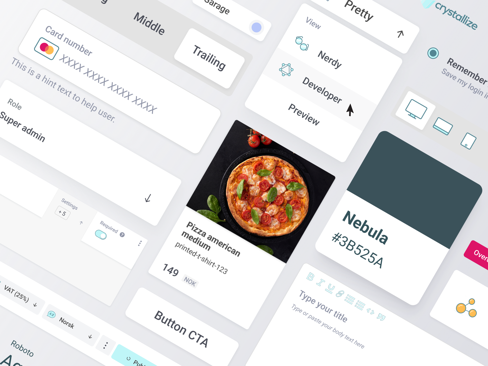
Style guides document design elements and how to use them. A style guide can also include rules for using certain elements and is more like a collection of all design elements.
Pattern libraries define user interface components, how they behave, and how they should be implemented. While a style guide focuses on how things look and where they can be used, pattern libraries act as a repository for UI / UX elements.
Design systems are all-encompassing and can be a bit more abstract. They can consist of both style guides and pattern libraries, along with other things such as documentation, procedures, code snippets, brand guidelines, workflows, and rules. A design system is a more holistic approach to design and is often design combined with engineering.
In short, style guides and pattern libraries are sub-elements of design systems. A design system is a much bigger structural framework that defines how visual designs work within the technology used.
The Importance of Design Systems
Design systems don’t only help designers work more efficiently—they serve as a resource for developers, too. Design systems close the gap between design and development teams by using shared language, reusable components, and consistent codebases as resources for both teams to access. Basically, a design system helps developers better understand how designs and prototypes are meant to be translated into code.
Design systems also make life easier for everyone by providing easy access to pre-made resources. Having a design system in place can also speed up the development process and help minimize misunderstandings during handoff.
How We Built our Design System?
Looking back, there were a number of steps we took to create our design system:
- Catalog Existing Components
- Research Other Design Systems
- Have Weekly Check-Ins
- Organize Components
- Define the Visual Design Language
- Start Using the Design System
- Iterate, Update, and Maintain
Step 1: Catalog Existing Components
The first thing we did was audit all of the reusable components found throughout our product. This included things like icons, buttons, colors, fonts, and more. By cataloging these different elements, we could discover design inconsistencies and think about how we could change things to make them more consistent.
For example, below is a look at the various button styles we had before we created our design system. We used a wide range of styles, colors, sizes, and corner radiuses.
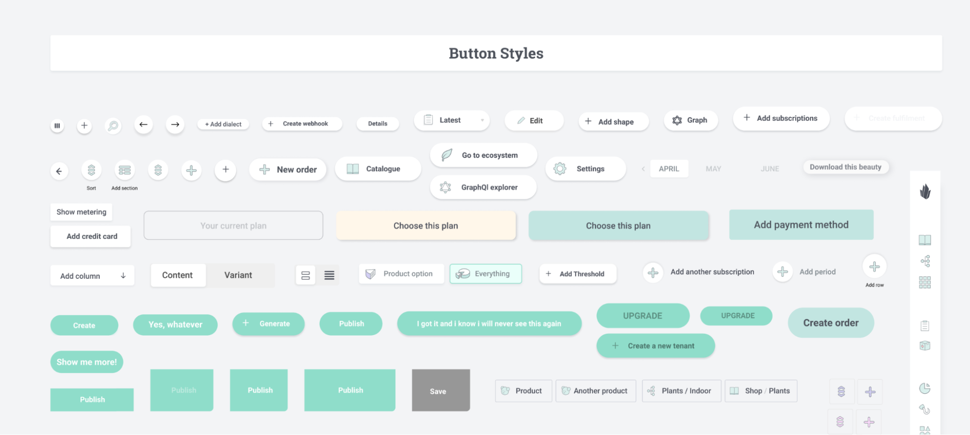
We wanted to streamline by reducing how many styles were being used. But we also wanted to give ourselves room to design with differently sized buttons.
Here’s a look at our button styles in our new design system:

The buttons here are more consistent while allowing different sizes and types of buttons (such as buttons with icons).
Because we created a catalog of all existing components, it helped us find inconsistencies and let us think about how we would deal with those inconsistencies moving forward.
Step 2: Research Other Design Systems
If you’re new to design systems like we were, creating one can seem like a daunting task. Fortunately, many companies and designers have already come up with elegant solutions on the best way to approach design systems. Better yet, many have even shared them by making them public. You can find a lot of free templates to help you get started, and there are also paid options as well if you’re looking for something more in-depth.
Here are a few of our favorite design systems (in no particular order):
Step 3: Have Weekly Check-Ins With the Team
As you build a design system, it’s essential to include key team members and stakeholders in updates and standups. That way, you can communicate changes and updates and how those things might affect others’ work.
By including others in the team early on, you can also learn how others might be able to contribute to the design system and figure out how to create consistency between the design side and the code side of things.
Step 4: Organize Components
As you build your design system, you’ll need to decide how to structure and name things. There is no right or wrong way to do this, but the way you organize your system should make sense to you and everyone else on the team.
One place to seek inspiration could be Brad Frost’s atomic design methodology. Basically, atomic design takes design elements and relates them to chemistry.
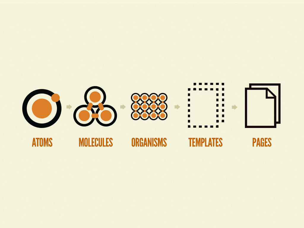
Basic UI ‘building blocks’ such as buttons, labels, and inputs are seen as atoms. You'd have a molecule if you take a button, label, input, and combine them to create a signup form. And so on!
Of course, however you decide to label and categorize your design system is entirely up to you—but whatever you choose should also make sense to the developers and key stakeholders on your team.
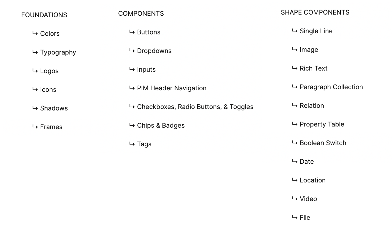
The way we decided to organize our design system was to split things up into three categories: foundations, components, and shape components.
Foundations are elements that are considered to be the building blocks of our product. Components are elements that use multiple elements pulled from foundations. And shape components are similar to components but are related to building products and pages in Crystallize.
Step 5: Define the Visual Design Language
One of our main goals when creating our design system was clearly defining our brand’s visual design language. We didn’t want to force designers to do things a certain way necessarily, but we did want to give them a framework to explore various approaches when designing for Crystallize.
Overall, we approached our visual language with a more loose and flexible approach, though this might not work for everyone. Some teams might prefer a more strict and structured approach, with a more rigorous process for introducing new things into the system.
Either way, if you can define your visual design language, it will help you create visual consistency throughout your product.
Step 6: Start Using the Design System
Once we defined our visual language and built our design system, it was important actually to start using it. We started talking to people on our team to figure out a strategy on how to begin implementing our new design system. We also talked to our developers to figure out what changes we’d need to make and what we could include in our system moving forward. To begin, we had to start creating new components in Figma and using them throughout our designs.
In the beginning, this will take some time—but once you start using your design system, you’ll save yourself (and your team) even more time in the long run. You’ll also be able to maintain consistency throughout your product and all of your designs!
Step 7: Iterate, Update, & Maintain
A design system is a dynamic reflection of your product design that will grow and change over time. Once our team started using our design system, we tried to approach it with the mindset that the design system would constantly be going through various iterations.
We also learned that whenever changes are made, they should be communicated to the team - whether that’s through a changelog, documentation, or any other method that suits your organization. Whatever you choose—updates should tell everyone what was changed and how that might impact their work.
Conclusion
Our design system is still a work in progress, but it has become essential to our product development. It’s also challenged us to think beyond design elements and consider our design's purpose and what we’re building.
Given how complex design systems are, we’ve only scratched the surface in this blog post on how to get started. It might seem like a lot at first, but breaking it down into steps can help make everything more manageable.
One step at a time!
Schedule a 1-on-1 demo so we can help you understand the ins and outs of design systems and content modeling in Crystallize. Or, why not START building for FREE.
You Should Also Read👇
What Is Composable Commerce?
No longer a buzz term, composable commerce represents a paradigm shift in eCommerce architecture, fundamentally redefining how businesses approach their online shopping experiences. Given the benefits, it’s no wonder.
Product Taxonomy: What Is It, Why Is It Important?
A great product taxonomy improves your customer's user experience and helps them find the right product more easily and quickly.
