New Editorial Experience for Product Storytelling
We are proud to release our new editorial experience for product storytelling. The pretty view is now officially released. A new visual representation of your products and product variants with a focus on creating an inspiring editorial experience. You also have a dedicated product variant view to simpler manage more complex products. This is our first step in a larger update for a more efficient and inspiring editorial experience.

Motivations
We wanted to improve the way you browse and edit products in Crystallize. We are all about product storytelling and want to inspire with a better editorial experience. Our design team has been working on two new editorial experiences for products; pretty view and nerdy view. The pretty view is the first one out.
On large and complex products with lots of variants, attributes or subscriptions we felt that we could provide a better editorial experience. Well, in all honestly our customers also told us 😉
The focus areas have for pretty view has been:
- Improving presentation and overview of product variants
- More efficient editorial experience on single product variants
- Inspire, let’s face it visual matter when creating content
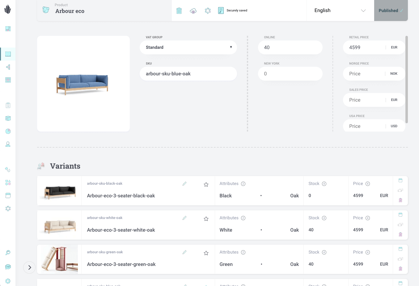
Product Pretty View 💅
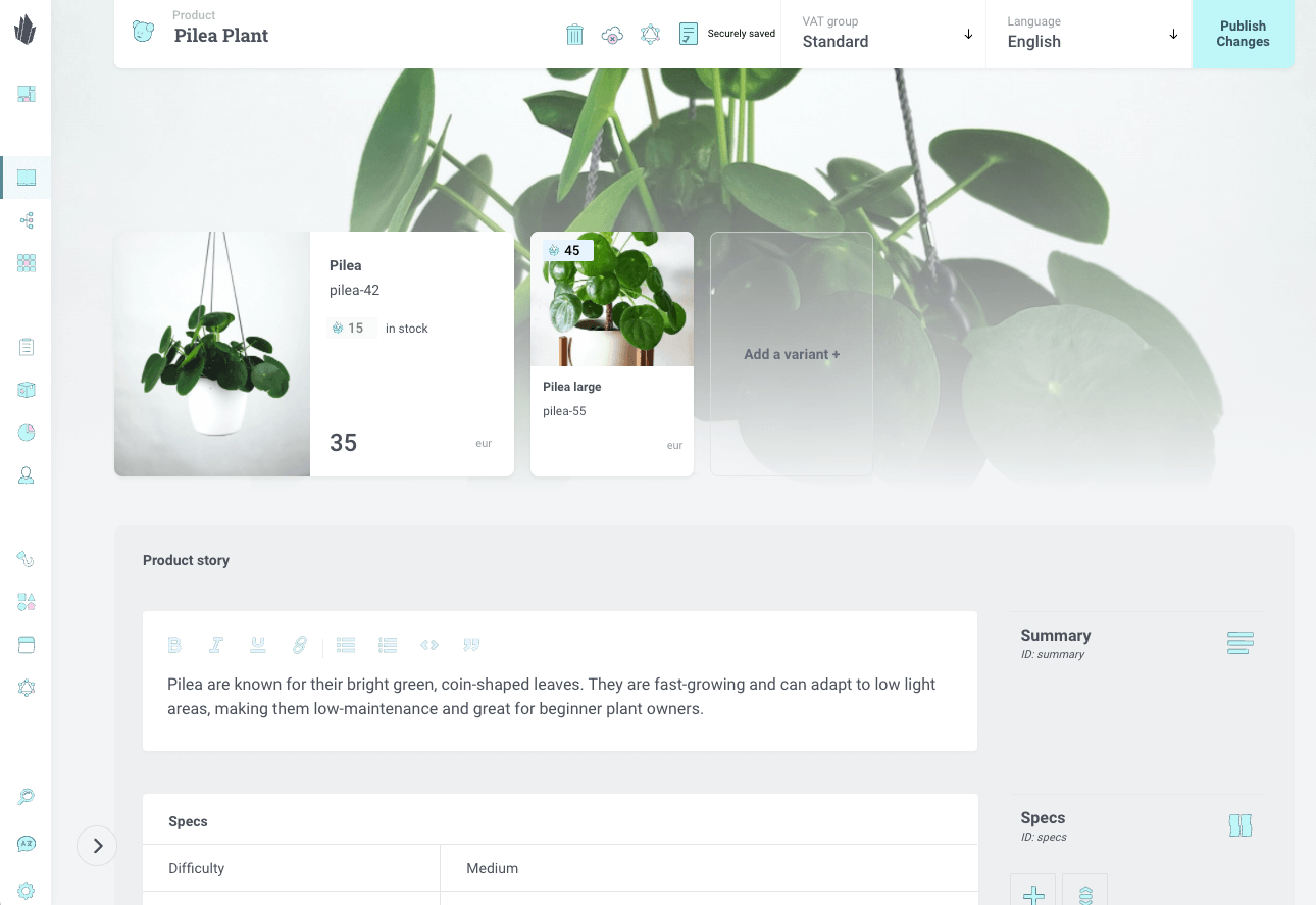
The default variant will feature a background image that will display behind the variants and its card is also wider. In these cases, the image is wider landscape mode.
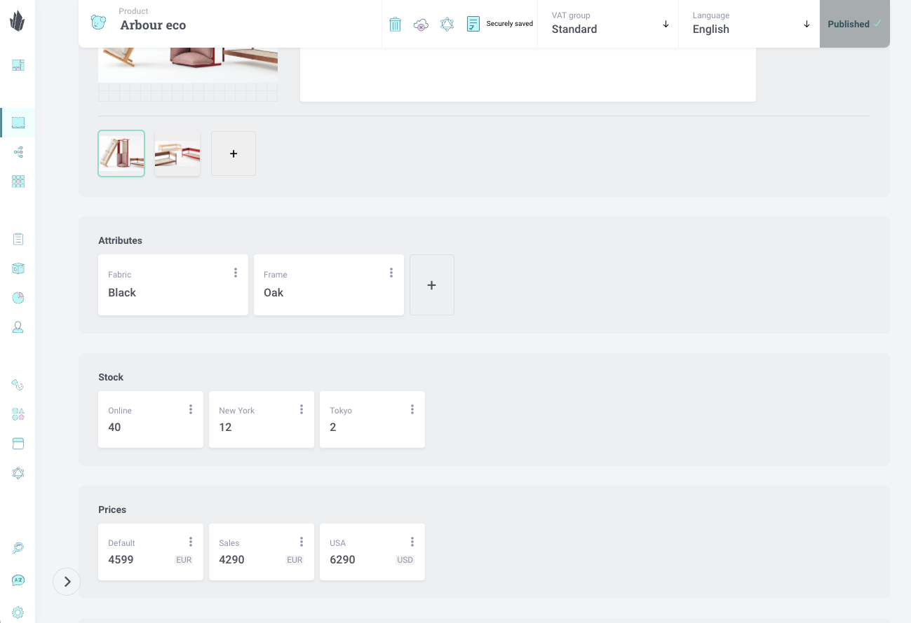
The variant card now features inputs for the name, SKU, and default stock and price. Other stocks and prices can now be found in the variant view, which can be accessed by clicking a variant card.
Product Variant View
This new view will present you with all the variant information, from its name to its subscriptions. You will encounter a better way to give your beautiful images alternative names and captions.
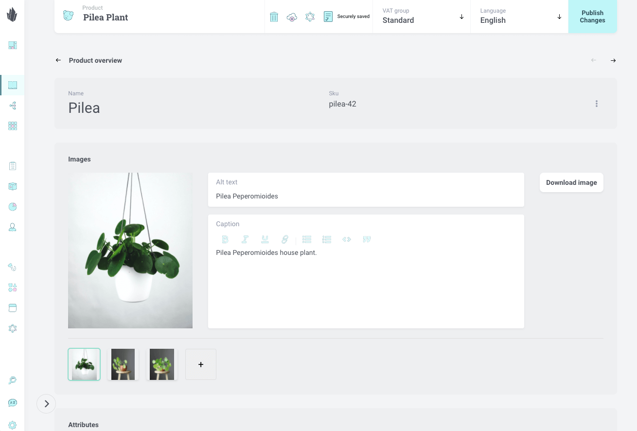
Adding new attributes is now easier than before as well as managing your stocks and prices. Even subscriptions are now easier to access and work with.
The navigation between variants is now straightforward, you just need to navigate between them with the navigation arrows below the publish button on the toolbar. This will make your editorial experience much better without the need to go back to the product view.
You can already check out the editorial experience with the new pretty view. We are eager to hear your feedback. Join our Slack community to discuss and comment.
Stay tuned for more, since we have something special to manage all of your product variants in a single place. You guessed it; the nerdy view 🤓

