React Image Sizes Attribute for Fast eCommerce
When using srcset, always accompany that with the sizes attribute.

Images are crucial for frontend performance. Responsive images with srcset is a good start. If you have many and large images, consider lazy loading them. Soon, we get native HTML lazyload in our favorite browser also. When we wrote about srcset, we mentioned the sizes attribute, but not the importance of using this attribute so the browser loads the properly-sized image.
Let’s dig in.
Background: Loading to Large Images
Let’s say that you have implemented responsive images by leveraging the awesome srcset attribute. However, after measuring the frontend performance of your website, you discover that the responsive images are performing poorly. They seem to be loading in a far larger resolution than they should. What is happening?
Browser Source Resolution
When the browser evaluates the HTML of your webpage, it scans it for images and initiates downloads of the images it can find along the way. If the browser supports srcset (which at least 90% of the browsers do), it will respect the different image variants and select one that it finds appropriate.
Let’s look at an example:
const imageVariants = [
  {
    url: "https://media.crystallize.com/demo/19/6/4/5/@500/speed-curve.jpg",
    width: 500
  },
  {
    url: "https://media.crystallize.com/demo/19/6/4/5/@1024/speed-curve.jpg",
    width: 1024
  },
  {
    url: "https://media.crystallize.com/demo/19/6/4/5/@3200/speed-curve.jpg",
    width: 3200
  }
];

const srcSet = imageVariants
  .map(variant => `${variant.url} ${variant.width}w`)
  .join(",");
const contentWidth = 800;

const App = () => {
  const [loadedSrc, setLoadedSrc] = React.useState(null);
  const onImageLoad = e => setLoadedSrc(e.target.currentSrc);

  return (
    <section
      style={{
        maxWidth: contentWidth,
        margin: "0 auto",
        background: "#fff",
        padding: "30px 10px"
      }}
    >
      <div>Screen width: {window.innerWidth}px</div>
      <div>Content width: {contentWidth}px</div>
      <img
        style={{ width: "100%", margin: "30px 0" }}
        alt="Cool bike"
        onLoad={onImageLoad}
        srcSet={srcSet}
        src={imageVariants[0].url}
      />
      {loadedSrc && <div style={{ wordBreak: 'break-word'}}>Browser chose this src:<br />{loadedSrc}</div>}
    </section>
  );
};

ReactDOM.render(<App />, document.getElementById("root"));
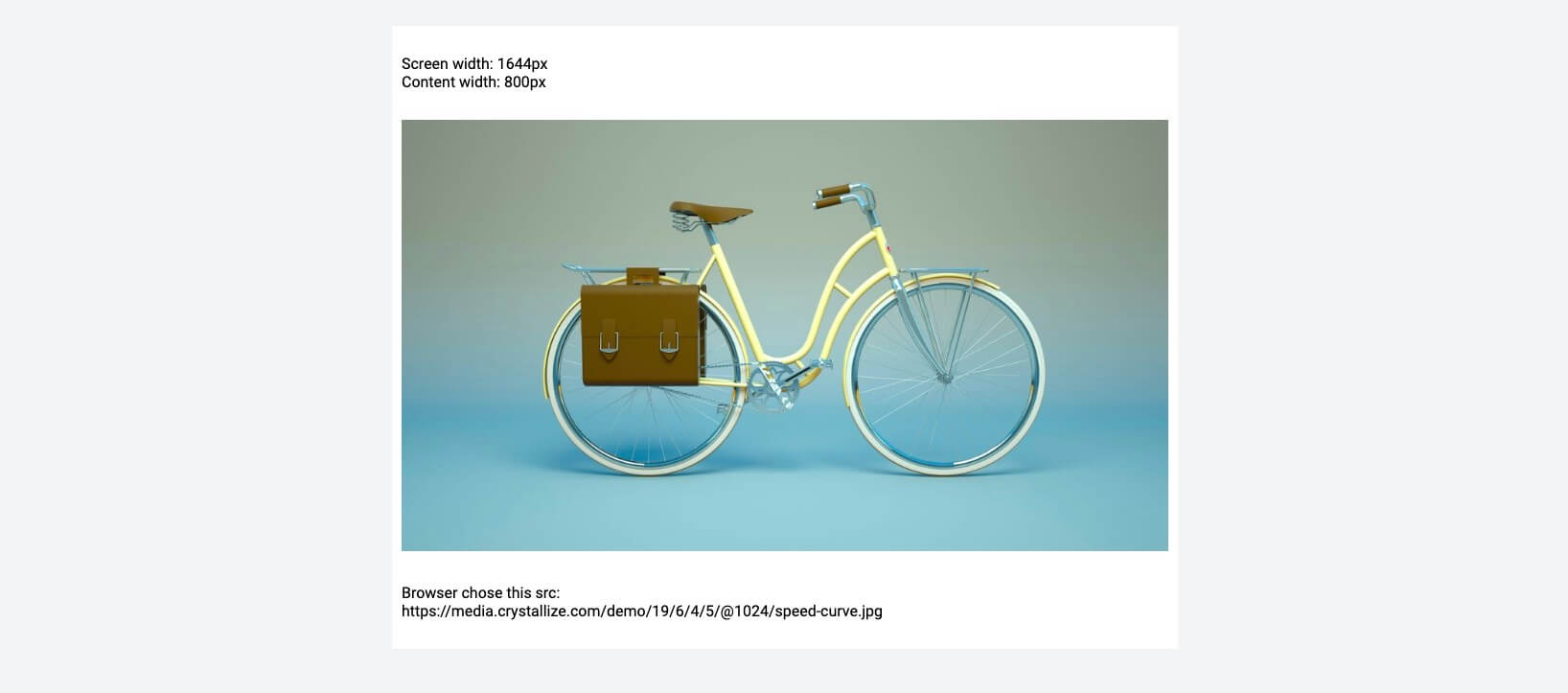
Here, we're constructing an image tag with the srcset attribute. Our main content area is a maximum of 800px wide, and the different image variants available go all the way up to 3200px.
When the browser reads this, it will try to guess which source to use for the image. It can’t take the CSS into consideration, since at the time of making this decision, the layout is not painted yet. Therefore, the browser has to use something else to determine the appropriate source to use: the current viewport width.
The result looks like this:

The browser has decided that the 3200px-wide image is the best one to use. It's the closest one to the current viewport width, and that's all the browser can use to select the source. It's making the wrong decision. What can we do to ensure that the correct source is chosen?
Aiding the Browser in Source Resolution
How can we help the browser to make the right decision for the source? In short: the sizes attribute. This is a way to tell the browser what different sizes the image is expected to have at different media queries. Examples:
sizes=”100px”The image is always going to be 100px wide.
sizes=”(max-width 500px) 500px, 1000px”If the screen is under 500px wide, the image is 500px wide. On all other screen sizes, it's 1000px.
Why do we need this, though? Can’t we just limit the srcset attribute to only include the sizes that our image is going to be displayed at?
No! Not all screens are the same, and the browser might sometimes pick a different image depending on browser settings. If the user wants to save data, the browser might always select the lowest possible width. If the screen has a high pixel density, it might choose a source that is double or triple the width of what it should be displayed as.
It's basically up to the browser, screen, and user preferences. We're just laying out all the possible information available so that the browser can make the correct choice.
React img Sizes
Let’s apply the correct sizes attribute for our image:
sizes="(max-width: 500px) 500px, 800px"After applying this, we now got the desired result.
On desktop:

On mobile:

Conclusion
When using srcset, always accompany that with the sizes attribute. It enables the browser to make the correct decision when loading your image. Check out our pen for a live demo on how it works: https://codepen.io/snowballdigital/pen/pXdJPQ
