Simple Responsive Illustrations in Plain HTML
When using illustrations, infographics, or diagrams you would often like to use a simplified version for mobile devices vs a full desktop display. Using the picture tag and a simple media query you can easily do this in good old HTML. No JavaScript or CSS trickery is needed. The same technique can also be used to serve responsive images that are optimized for site speed.
Live Responsive Illustration Demo
Check out the live example of the responsive illustration. Just resize the browser or load it on your phone.
Live Responsive Illustration Demo
Check out the live example of the responsive illustration. Just resize the browser or load it on your phone.
Switching Illustration Based on Device Screen Size
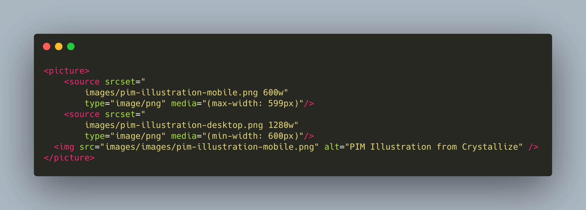
Using the <picture>, <source> and a simple media query you can easily swap out an illustration based on the screen size. This is useful for infographics or diagrams where simply scaling down for mobile does not work. You want to tailor-make a simplified illustration for mobile devices.
This technique can also be used to display a responsive logo based on screen size. Very handy.
In general, you can use srcset for responsive images. Typically you have different resolutions of the same image to deliver the appropriate size for the given device. For better frontend performance.
This example below loads a different illustration in PNG format with a screen breakpoint of 600 pixels.

Site Speed and Responsive Images
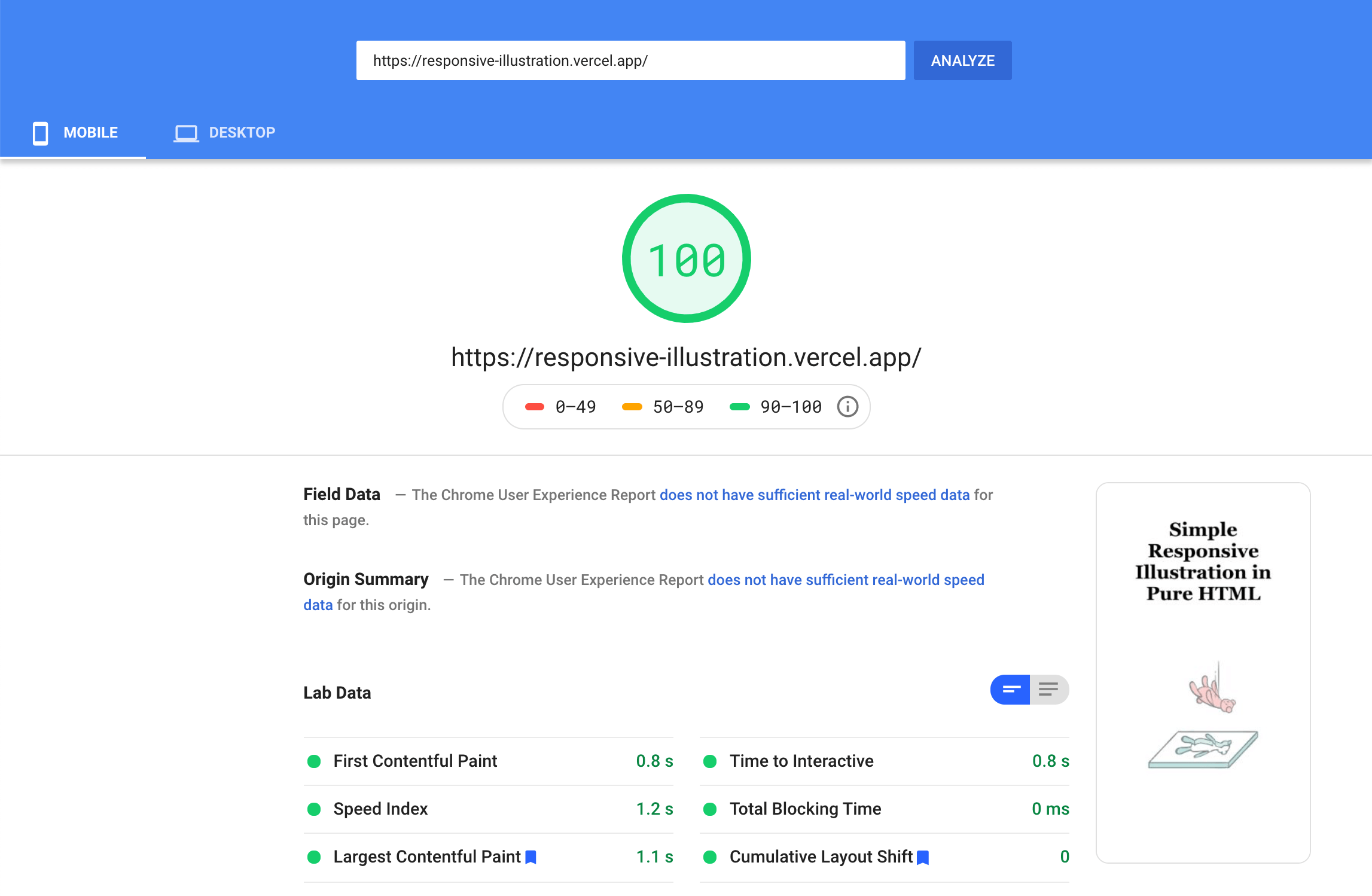
When optimizing for site speed you want to make sure that you load the right sized image for mobile. Mobile speed is important when optimizing the core web vitals.
Switching to a smaller image on mobile and in addition having a WebP version of the image is great for site speed.


