Best Design Practices for Crafting Engaging and Effective eCommerce Websites
Ensuring your eCommerce website's design captures attention today goes beyond aesthetics. Design is just one piece of the puzzle of online business success, and it all starts with your product/service and brand.

Sure enough, staying true to your brand’s identity matters, but it matters just as much as creating a seamless, engaging shopping experience that easily guides visitors from the homepage to checkout. It matters just as much as your website performance or having an omnichannel strategy in place.
Given that the design of your eCommerce store depends greatly on your product, product industry standards, and audience expectations, crafting a one-size-fits-all web design guide is not really feasible.
So, instead of creating a universal blueprint for eCommerce web design, here we’ll focus on articulating a set of best practices we see successful online stores (our clients) implement, be it for the sake of UX or SEO or they are simply cool to have 🙂
🛑Before We Start.

This article has been in the making for a long time and has survived many iterations, from a classic checklist article to a guide on building a high-converting eCommerce store. None of these satisfied the main goal: to provide you with a foundation upon which you can build and customize your online presence, ensuring you nail design and strategy that aligns with your unique brand identity and operational needs.
That said, this is the best we can do. Handle it with care and use it with caution.
Tech Behind Your Storefront: Hosting and Framework
The decisions surrounding hosting and frontend frameworks are foundational to building an eCommerce store that is fast, secure, scalable, and compliant. These choices impact not just the technical underpinnings of your site but also the customer experience, your brand's reputation, and, ultimately, the success of your online business.
Hosting
Your hosting service directly influences the speed and availability of your eCommerce store. A fast, reliable hosting solution ensures that your website loads quickly, which is vital for keeping customers engaged and reducing bounce rates.
When looking for hosting, look for providers that offer at least 99.9% uptime. Select a host with fast server response times and integration of content delivery networks (CDN). Ensure the hosting plan can handle increased traffic and storage needs as your business grows.
The right hosting provider implements robust security measures such as SSL certificates, data encryption, firewalls, and regular security audits to protect against breaches and cyber-attacks.
Finally, prioritized solutions that offer 24/7 customer support and a comprehensive knowledge base.
Frontend
We all have our favorites. Dhairya made a cool post about frontend frameworks we see excelling in dev experience in 2024. The usual suspects in our scope and those of our clients are Next JS, Remix Run, Svelte, and Astro. The thing is, you can use any tech you feel comfortable working with.
php might not be one of the cool kids, but if it does the job … who cares? Use the framework you are most familiar with.
The frontend framework determines your store's look, feel, and responsiveness. It can create a seamless, engaging shopping experience for your audience by optimizing page load times, ensuring the website is responsive across all devices, and improving the overall interface. This leads to a positive user experience, encouraging customers to stay longer and explore more products.
Clear performance metrics and KPIs are the first things you must establish to improve on all of the above.
Designing an Engaging User Interface
An exceptional user interface (UI) attracts and retains customers on your home, category, and product pages. And it starts with an effective page layout design that serves as the backbone of user experience and communication on a website, blending aesthetics, functionality, and content strategy to guide users through your website's journey.
Here are the key elements that characterize an effective page layout design and a couple of tricks for achieving it.
Responsiveness
Why are we still talking about this? In the era of mobile phones and long screen times, ensuring your website adapts to different screen sizes and devices and offers a seamless experience for all users (no matter the screen) is necessary.
Consistency
Consistent design elements across pages reinforce your brand identity and improve usability. Consistency in navigation, font choices, color schemes, and button styles helps users learn your site's layout faster, making the browsing experience more intuitive.
Visual Hierarchy
Organize content with headings, subheadings, and whitespace to create a clear page structure. A well-defined hierarchy helps users (and search engines) understand the importance of each element on the page. You can direct attention to critical sections using size, color, and placement.
Ensure only one H1 tag is present at all times and on all screens above the fold; it is the biggest font on the screen.
Effective use of whitespace, or negative space, around text and titles improves readability and focuses user attention on the content and elements that matter most.
Above the Fold (ATF) Matter More than You Think
Above the fold refers to the visible part of a webpage (be it on your desktop, mobile, or tablet) before the user scrolls down. The importance of ATF is twofold: it is crucial in capturing visitors’ attention, and Google considers content near the top of a page to be more important. Thus, ATF content can have a more significant impact on your search rankings than the content that follows.
Header
Elements to consider for inclusion in your website header: dropdown menu for categories, sign-in/signup links, region/language flag, search function, and shopping cart icon.
Look at how Fender does it.

Category and subCategory Pages
Set up an easy-to-browse category and sub-category pages featuring:
Clear navigation — categories, tags, filters
Advanced functionality — filter search by size, color, and material.
Always keep the filters option above products (or in the sidebar) if you use them. Allow indexing for pages with a single filter. For pages with multi-filters, noindex. And nofollow on filter paging. Pagination can be challenging if you have a lot of products/pages. Learn how not to spend your entire crawling budget on poorly executed pagination here.
While having them might sound like a good idea, different grid layout options are rarely used. The same goes for functions in grid view (like ascending, descending, etc.).
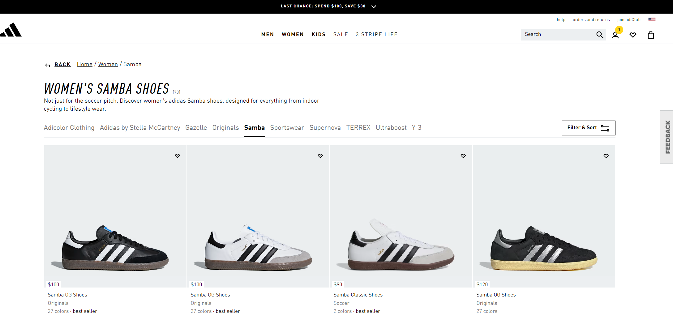
Finally, the product box should be a click element, not just a product name. Addidas's management of its category and sub-category pages is a great example of all of the above.

Optimizing Product Listings and Descriptions
Compelling product listing is crucial for driving conversions, and it all starts with a product page that covers both CRO and SEO best practices, starting with a keyword (related to your product) in H1, in <title> tag, and in the product page URL.
Visual representation is crucial in eCommerce. Showcase products with high-quality images (from various angles), 360-degree views, a video, or even AR integrations that can enhance product visualization. Have a look at what Sweef (furniture company) did for their UX just by adding a product configurator.
Craft informative, engaging product descriptions highlighting key features, benefits, and specifications with clear pricing and availability (shipping costs and stock availability as well).
Social media integration is crucial for increasing brand visibility and driving traffic to your eCommerce website. Make it easy for users to share your products and content on their social media profiles. Feature customer photos, reviews, or testimonials on your page to foster a sense of community and authenticity.
There is more to product page optimization in our SEO for Product Pages (The Basics) post.
Our FRNTR demo store is an awesome example of a product page going beyond product with product storytelling.
Optimizing Product Listings and Descriptions
Compelling product listing is crucial for driving conversions, and it all starts with a product page that covers both CRO and SEO best practices, starting with a keyword (related to your product) in H1, in <title> tag, and in the product page URL. Visual representation is crucial in eCommerce. Showcase products with high-quality images (from various angles), 360-degree views, a video, or even AR integrations that can enhance product visualization. Have a look at what Sweef (furniture company) did for their UX just by adding a product configurator. Craft informative, engaging product descriptions highlighting key features, benefits, and specifications with clear pricing and availability (shipping costs and stock availability as well). Social media integration is crucial for increasing brand visibility and driving traffic to your eCommerce website. Make it easy for users to share your products and content on their social media profiles. Feature customer photos, reviews, or testimonials on your page to foster a sense of community and authenticity. There is more to product page optimization in our SEO for Product Pages (The Basics) post. Our FRNTR demo store is an awesome example of a product page going beyond product with product storytelling.
Personalize the Shopping Experience
Personalization can significantly improve the shopping experience and boost conversion rates. Use algorithms and customer data to suggest relevant products based on browsing history, purchase history, and user preferences.
Offer personalized discounts or promotions to reward loyal customers or incentivize first-time buyers. You can also allow them to customize your product to their liking.
Go Beyond Product
Share industry news, product usage tips, or company updates. Offer guides on how to use products effectively. Provide downloadable content, like eBooks, product manuals, or tutorials, that can add value to the user's journey, positioning your brand as an industry expert.
We’ve shown you our FRNTR demo as an example, but don’t just take our word for it. Take Addidas, a world-renowned sports brand, for example. They are in the business of selling sportswear, but they are also in the business of storytelling, as this article shows.
You need CMS functionality in your eCommerce platform or independent CMS for storytelling beyond product pages. The example above shows the brand relies on Salesforce Commerce + SDL Tridion as CMS. On the other hand, the FRNTR example is all Crystallize😎
Implement a Seamless Checkout Process
A streamlined checkout process reduces cart abandonment and increases conversions. Consider implementing one of the following strategies.
Allow customers to complete their purchases without creating an account. Guest checkout largely depends on the product. It might be useful if you want to emphasize the benefits of signing up (give discounts, etc.) or if you have a product that’s usually bought just once (purchasing a bike online comes to mind).
Reduce the number of fields on the checkout page. Display a progress bar to show customers their position in the checkout process. Also, offers a variety of payment methods, including credit cards, PayPal, and digital wallets.
Provide shipping estimates and tax calculations early in the process to prevent surprises.

Performance
In case you haven’t noticed, we at Crystallize geek out a lot about performance. In fact, Big G recognized this and ranked us in the top three spots for many performance-related queries (I know, shameful self-promotion, but it’s true).
The whole section of our LEARN (docs) is dedicated to frontend performance. Website performance and page speed are foundational elements in the design and operation of eCommerce platforms. They influence user experience, conversion rates, SEO rankings, mobile usability, and cost efficiency.
Advanced UX Elements
Advanced UX (User Experience) elements in eCommerce websites are features and design strategies beyond basic usability that significantly enhance users' shopping experience, engagement, and satisfaction. A couple we mention here have already been accepted by many.
Product Configurators
One of the best ways to offer a complete personalized shopping experience is with product configurators. The furniture Sweef, already mentioned, is one great example of enhanced UX with a personalized configurator.
Another is the amazing Mercedes-Benz 3D Product Configurator from Bertel O. Steen. It allows you to design, visualize, and purchase a vehicle that meets and exceeds your standards. This is a new era of car buying, where every decision is yours to command and preview before purchase.
Product Configurators
One of the best ways to offer a complete personalized shopping experience is with product configurators. The furniture Sweef, already mentioned, is one great example of enhanced UX with a personalized configurator. Another is the amazing Mercedes-Benz 3D Product Configurator from Bertel O. Steen. It allows you to design, visualize, and purchase a vehicle that meets and exceeds your standards. This is a new era of car buying, where every decision is yours to command and preview before purchase.
BTW, you can have a head start over your competitors with our open-source 3D product configurator boilerplate (powered by Crystallize, CharpstAR, and Next.js). The boilerplate gives you a foundation for delivering an immersive shopping experience to your audience.
Chatbots
Chatbots and AI-driven tools offer real-time assistance to shoppers, answering queries, providing recommendations, and assisting with transactions. These tools can significantly enhance customer service by offering immediate support anytime, reducing wait times, and improving overall customer satisfaction. And when we talk about customer service...
Exceptional Customer Support
Providing top-notch customer support might not be a design thing, but it is essential for building trust, retaining customers, and encouraging repeat purchases. Provide various ways for customers to reach you, such as email, live chat, phone, or social media.
Respond to customer inquiries promptly and resolve issues efficiently. Keep customers informed about the status of their orders and any potential delays.
Security and Privacy
With eCommerce, security cannot be overstated. A section on ensuring customer data protection, secure payment gateways, and adherence to privacy laws (like GDPR for European customers) does not sound like a design thing. However, making sure what is stated in that section is delivered through tech and design decisions is important.
Start Today
If your web design fails to make a great first impression, visitors are likelier to leave without a purchase. 94% of first impressions relate to your site’s web design (source).
As we already said, today's design goes beyond aesthetics, and this post is just the beginning of your online store design journey.
Interesting Reads on Design in eCommerce
Dig deeper with the following posts we found interesting to share:
The never-ending quest to create the perfect homepage - https://wrap-text.equals.com/p/creating-the-perfect-homepage
AI In Ecommerce - https://theecommmanager.com/ecommerce/ai-in-ecommerce/
Lessons Learned from $200M+ in DTC eCommerce Sales - https://www.adkings.agency/51-lessons-learned-from-200m-in-dtc-ecommerce-sales
10 Principles Of Good Web Design - https://www.smashingmagazine.com/2008/01/10-principles-of-effective-web-design/
We can help! We can point you in the right direction and have your back end 😁
START building for FREE with Crystallize or schedule a 1-on-1 demo so we can show you how to scale your business effortlessly with the Composable Commerce approach.
Connect the Dots👇

Comprehensive Guide to Modern eCommerce Web Development: Trends, Approaches, and Best Practices
Explore the latest trends, development approaches, and best practices to build high-performing online stores in modern e-commerce web development.

Choosing an eCommerce Platform Today Is Hard
Choosing the best eCommerce platform is one of the most important decisions you must make at the very start of your eCommerce journey if you want to have a jaw-dropping, money-making storefront.

How to Build a Successful Multilingual eCommerce?
In today's global economy, multilingual eCommerce is not just an option; it's a strategic imperative.

