Page Builder
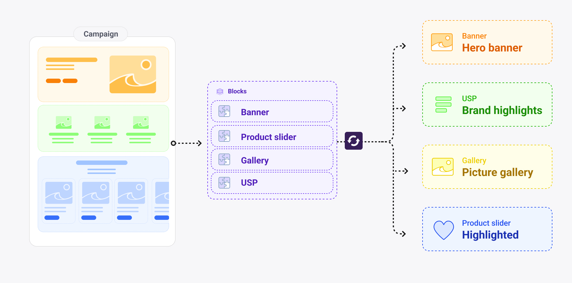
The Page Builder pattern is a data modeling design pattern for composing flexible, editor-controlled page layouts from a curated set of reusable section types. Instead of building a fixed page structure into a shape, this pattern turns a page into an ordered list of independently configured blocks — enabling editors to assemble and rearrange content sections without developer involvement.
The pattern is particularly well-suited to landing pages and category pages, where marketing and editorial teams need to create varied layouts across campaigns, seasons and locales without touching code.
When to use it
Use this pattern when editors need to compose pages freely from a defined library of section types, when the same visual components should be reusable across multiple page shapes, and when per-block visual control (theme, width, background) is required. It works best when the set of available section types is bounded and known in advance.
Avoid it for pages with a fixed, prescribed layout — such as a structured product detail page — where an explicit component set per field is clearer and easier to maintain.
How it works
The pattern is built on three Crystallize primitives working together.
The block slot — componentMultipleChoice
Each page shape gets a single component named blocks of type componentMultipleChoice. The choices in this field are references to piece shapes, each representing one section type. Editors add blocks from this list in any order, and because allowDuplicates is enabled, the same section type can appear multiple times on the same page.
{
  "id": "blocks",
  "type": "componentMultipleChoice",
  "name": "Blocks",
  "config": {
    "componentMultipleChoice": {
      "multilingual": true,
      "allowDuplicates": true,
      "choices": [
        { "id": "banner",              "type": "piece", "config": { "piece": { "identifier": "banner" } } },
        { "id": "feature-highlights",  "type": "piece", "config": { "piece": { "identifier": "feature-highlights" } } },
        { "id": "product-slider",      "type": "piece", "config": { "piece": { "identifier": "product-slider" } } },
        { "id": "story-slider",        "type": "piece", "config": { "piece": { "identifier": "story-slider" } } },
        { "id": "picture-grid",        "type": "piece", "config": { "piece": { "identifier": "picture-grid" } } },
        { "id": "category-slider",     "type": "piece", "config": { "piece": { "identifier": "category-slider" } } }
      ]
    }
  }
}
{
"id": "blocks",
"type": "componentMultipleChoice",
"name": "Blocks",
"config": {
"componentMultipleChoice": {
"multilingual": true,
"allowDuplicates": true,
"choices": [
{ "id": "banner", "type": "piece", "config": { "piece": { "identifier": "banner" } } },
{ "id": "feature-highlights", "type": "piece", "config": { "piece": { "identifier": "feature-highlights" } } },
{ "id": "product-slider", "type": "piece", "config": { "piece": { "identifier": "product-slider" } } },
{ "id": "story-slider", "type": "piece", "config": { "piece": { "identifier": "story-slider" } } },
{ "id": "picture-grid", "type": "piece", "config": { "piece": { "identifier": "picture-grid" } } },
{ "id": "category-slider", "type": "piece", "config": { "piece": { "identifier": "category-slider" } } }
]
}
}
}multilingual: true on the block slot means block content can be independently translated per locale while the block structure itself stays consistent.
Block pieces — the section library
Each block is a piece shape with its own set of components. Pieces are defined once and referenced by any number of shapes — a landing-page and a category shape can share the exact same block library without duplicating configuration.
A typical block contains its own content fields (title, description, media or relations), plus a reference to the shared layout piece that controls its visual presentation.
Block | What it renders | Notable components |
|---|---|---|
| Hero or promotional section | title, description, image, call-to-action |
| USP grid | repeatable
via
|
| Curated product carousel |
→ product shape |
| Editorial story carousel |
→ story shape |
| Fixed four-image visual grid | images with
|
| Category navigation carousel |
→ category shape |
The layout piece — shared styling contract
Every block piece embeds a layout piece as a component. This gives editors per-block control over visual presentation without duplicating the same fields across every block piece. Changing an option in the layout piece (for example, adding a new theme) propagates to all blocks automatically.
{
  "identifier": "layout",
  "components": [
    {
      "id": "display-width",
      "type": "selection",
      "config": {
        "selection": {
          "options": [
            { "key": "contain", "value": "Contain", "isPreselected": true },
            { "key": "stretch", "value": "Stretch" }
          ]
        }
      }
    },
    {
      "id": "theme",
      "type": "selection",
      "config": {
        "selection": {
          "options": [
            { "key": "light",  "value": "Light", "isPreselected": true },
            { "key": "dark",   "value": "Dark" },
            { "key": "muted",  "value": "Muted" },
            { "key": "pastel", "value": "Pastel" },
            { "key": "vivid",  "value": "Vivid" }
          ]
        }
      }
    },
    {
      "id": "background-media",
      "type": "componentChoice",
      "config": {
        "componentChoice": {
          "choices": [
            { "id": "image", "type": "images" },
            { "id": "video", "type": "videos" }
          ]
        }
      }
    }
  ]
}
{
"identifier": "layout",
"components": [
{
"id": "display-width",
"type": "selection",
"config": {
"selection": {
"options": [
{ "key": "contain", "value": "Contain", "isPreselected": true },
{ "key": "stretch", "value": "Stretch" }
]
}
}
},
{
"id": "theme",
"type": "selection",
"config": {
"selection": {
"options": [
{ "key": "light", "value": "Light", "isPreselected": true },
{ "key": "dark", "value": "Dark" },
{ "key": "muted", "value": "Muted" },
{ "key": "pastel", "value": "Pastel" },
{ "key": "vivid", "value": "Vivid" }
]
}
}
},
{
"id": "background-media",
"type": "componentChoice",
"config": {
"componentChoice": {
"choices": [
{ "id": "image", "type": "images" },
{ "id": "video", "type": "videos" }
]
}
}
}
]
}display-width controls whether the block spans the full viewport (stretch) or sits within a max-width wrapper (contain). theme applies a colour palette. background-media uses componentChoice so only an image or a video can be active at once — not both.
Supporting patterns
componentChoice for exclusive alternatives
When a field should hold one value from a set of structurally different types, use componentChoice. In the layout piece, background-media uses this to enforce that a block has either an image background or a video background. The same pattern appears in story media, where the choices are image, shoppable-image or video, and in navigation items where a link is either a raw URL or an item relation.
componentChoice is appropriate when only one option should be active at a time and the options have different field structures. When options share the same type but differ in meaning (e.g. choosing from a fixed list of string values), use selection instead.
contentChunk for inline repeatable groups
When a block needs an editor-managed list of structured items that don't warrant their own shape in the catalogue, use contentChunk with repeatable: true. The feature-highlights block uses this for its USP list, where each item has a headline, description and icon. The call-to-action piece uses it for a repeatable list of {label, url} button pairs.
Use contentChunk when the items only exist in the context of their parent block. Use itemRelations when the items are independently managed content — products, stories and categories are items with their own lifecycle, so they are referenced rather than embedded.
Shared utility pieces
Beyond layout, smaller pieces serve as reusable field groups embedded across multiple shapes. A meta piece containing SEO title, description and image is referenced by landing-page, category, product and story. A dimensions piece with width, height, depth and weight fields is shared between the product shape and product variant components. This means a change to the meta or dimensions structure is made in one place and applies everywhere.
Considerations
Keep the block library bounded. The value of the pattern comes from having a defined, renderable set of section types. Adding too many block types creates cognitive overhead for editors and maintenance overhead for developers. Prefer fewer, more flexible blocks over a large number of highly specific ones.
Use allowDuplicates: true by default. Pages frequently need the same block type more than once — two banners, two product sliders for different collections, or a feature highlights block at the top and bottom of a page. Restricting this should be a deliberate decision based on a real content rule, not a default.
Apply layout as a wrapper in the frontend, not inside block components. Block components should be unaware of their display width or background. The layout values belong in a wrapper component that handles the outer presentation, keeping block components pure and reusable in other contexts.
Reuse the same block set across shapes. If a landing-page and a category shape use the same blocks, define the choices identically and reference the same pieces. This ensures editors have a consistent authoring experience regardless of which shape they are working in, and ensures the frontend renderer handles the same set of block types everywhere.
Switch on block type to render. When consuming the blocks array via the API, the discriminator is the selected piece identifier. Map each identifier to its corresponding frontend component, and apply the layout piece values as wrapper props around it.